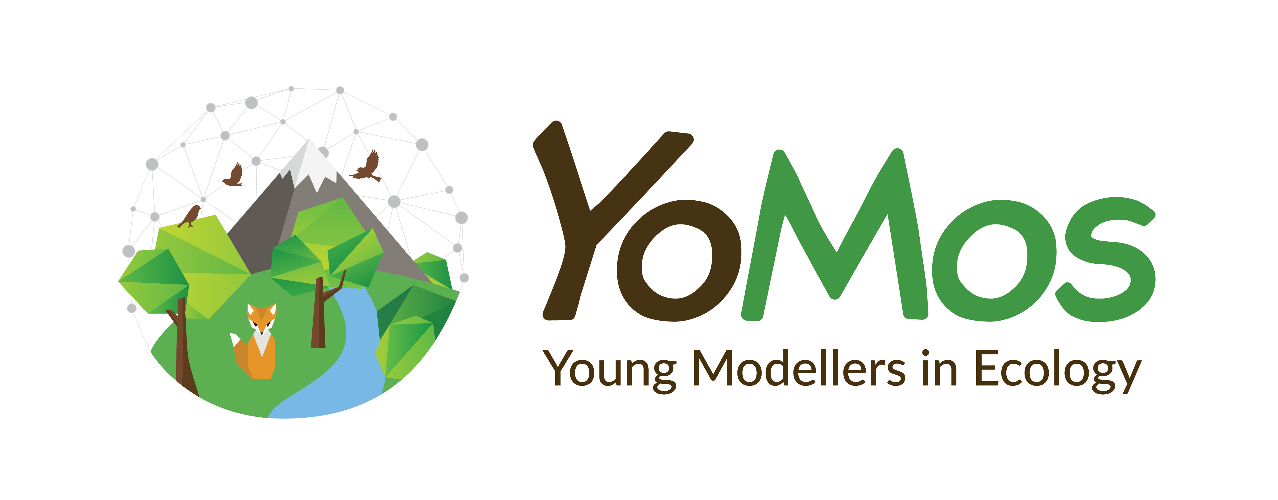
The organizational team of the YoMos worked on the new design of our logo and we are proud to present to you our final version:

Ideas behind the new design:
We had the idea to replace the abstract tree by a composition of our different disciplines. There are two reasons we had to do this – first, we are covering more topics than “just” forest or botanical issues and second, there are tons of ecological logos around using green trees and/or leaves.
The new logo incorporates different disciplines, which cover the large range of topics the YoMos are working on – there is water, land surface, and air, there are animals and plants of all types as well as soil, lowland and mountains, and even theory-driven science is shown by the network. This represents the modelling part of our work and in addition also the network we form as young modellers. We really like this idea and hope you will do so too!
Together with the graphic designer (Anna Neiswestnich, www.neisdesign.berlin ) we were thinking about how to bring together all these parts. All elements we mentioned above have found their place without too much crowding on the small world we created here.
The recognition value comes with the font we used here–it is the same we had before. In addition, we decided to use two colors here to brighten it a little bit up.
Furthermore, we used the opportunity to launch our homepage with an updated design and more possibilities to maintain a platform to stay connected for the YoMos member.
We hope to hear your feedback and hope you are as happy as we are!
Best wishes,
The YoMos organizational team
